Models
By clicking on the models menu of top experiment navigation, you will access the model list trained for this experiment version. you will also, at the bottom of the page, find information regarding the model selected for this train.
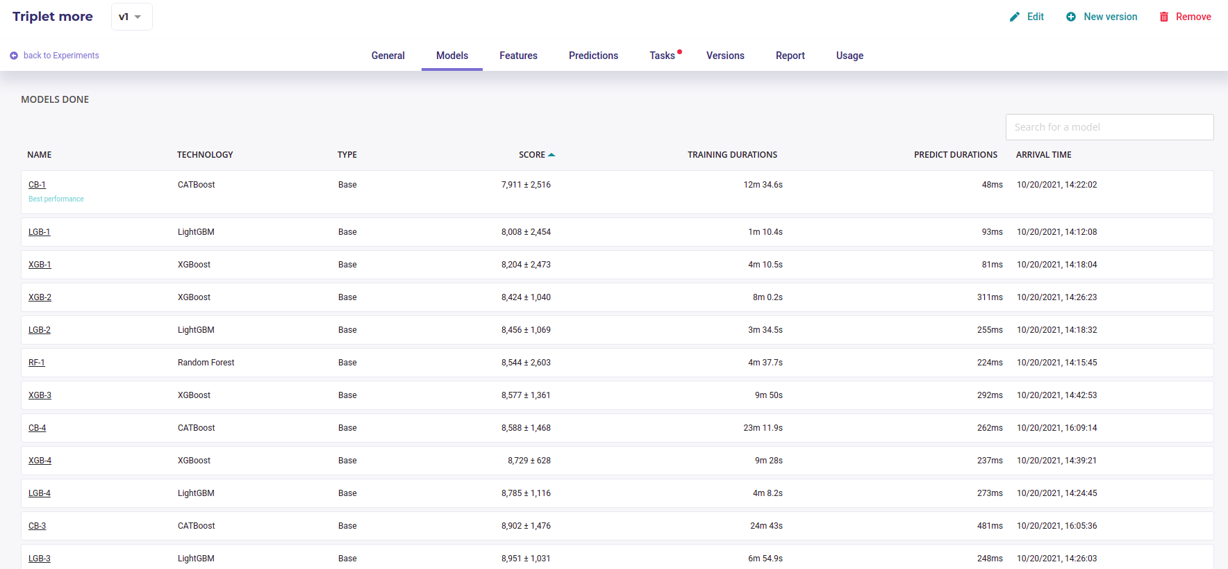
Model List
By clicking on the model name in the list, you will be redirected to the model detail page. Please note that a toggle button is available on the right side of the list for each model. This toggle allows you to tag a model as deployable. In order to know how to deploy a model, please go to the dedicated section.
Each model page is specific to the datatype/training type you choose for the experiment training. Screens and functionality for each training type will be explained in the following sections. You can access a model page by two ways :
by clicking on a graph entry from the general experiment page
by clicking on a list entry from the models top navigation bar entry
Then you will land on the selected model page splitted in different parts regarding the training type.
For each kind of tabular training type, the model general information will be displayed on the top of the screen. Three sections will be available.
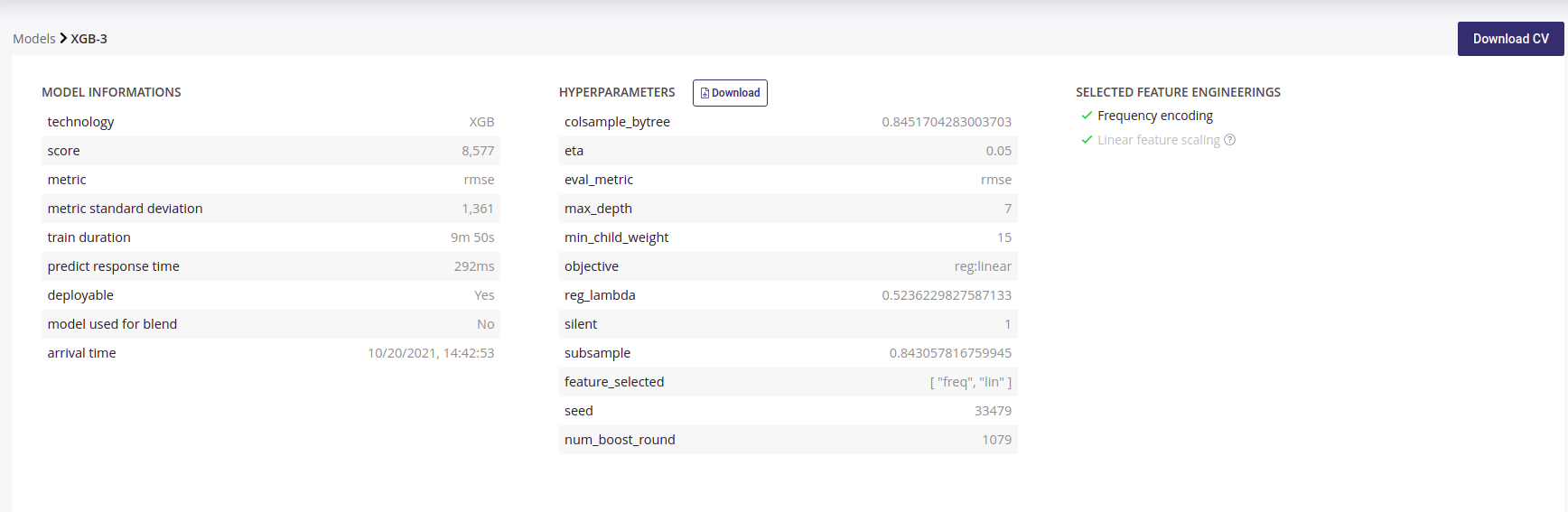
Model detail
Model information : information about the trained model such as the selected metric and the model score
Hyperparameters : downloadable list of hyperparameters applied on this model during the training
Selected feature engineerings (for regression, classification & multi-classification) : features engineerings applied during the training
Preprocessing (for text similarity experiments) : list of pre-processing applied on textual features
Please note that for following experiments types, the general information parts is different than from others :
Image detection experiments : no feature engineering
text similarity experiments : preprocessing are displayed instead of feature engineering
Cross Validation File
Each time a Model is built, a Cross Validation is performed on trainset. All score and charts displayed on this page, except those explicitly built on holdout files, are computed by performing a k-fold cross Validation on your trainset with k=5 as default values.
If you selected a fold column when configuring your experiment, the fold are built using those you provided. You can read the guide about having a good cross validation strategy.
You can download the cross validation file for any model by clicking on the upper right button **Download CV*. Inside it you will find prediction for each fold when training is done on the other folds.
For example, the line :
customerid,target,pred_target_1,__fold__
15712807,1,0.23583529833568478,2
Means that the sample whom customerid is 15712807 has received the fold number “2” and when the model was trained on a dataset with only folds 1,3,4 and 5, it predicted 0.23583 for this sample.
By downloading the Cross Validation file, you can perform further investigation on performance of your model for specific groups or range of values.
Note that the detail of metrics for each fold is not displayed on the page. Each metrics is infact the average of each fold
All this metrics are average of metrics for each fold
Model page - graphs explanation
In order to better understand the selected model, several graphical analyses are displayed on a model page. Depending on the nature of the experiment, the displayed graphs change. Here an overview of displayed analysis depending on the experiment type.
chart |
regression |
classification |
multi-classification |
text similarity |
Time series |
Image regression |
Image classification |
Image multi-classification |
Image detection |
|---|---|---|---|---|---|---|---|---|---|
Scatter plot graph |
Yes |
No |
No |
No |
Yes |
Yes |
No |
No |
No |
Residual errors distribution |
Yes |
No |
No |
No |
Yes |
Yes |
No |
No |
No |
Score table (textual) |
Yes |
No |
No |
No |
Yes |
Yes |
No |
No |
No |
Residual errors distribution |
No |
No |
No |
No |
No |
No |
No |
No |
No |
Score table (overall) |
No |
No |
Yes |
No |
No |
No |
No |
Yes |
No |
Cost matrix |
No |
Yes |
No |
No |
No |
No |
Yes |
No |
No |
Density chart |
No |
Yes |
No |
No |
No |
No |
Yes |
No |
No |
Confusion matrix |
No |
Yes |
Yes |
No |
No |
No |
Yes |
Yes |
No |
Score table (by class) |
No |
Yes |
Yes |
No |
No |
No |
Yes |
Yes |
No |
Gain chart |
No |
Yes |
No |
No |
No |
No |
Yes |
No |
No |
Decision chart |
No |
Yes |
No |
No |
No |
No |
Yes |
No |
No |
lift per bin |
No |
Yes |
No |
No |
No |
No |
Yes |
No |
No |
Cumulated lift |
No |
Yes |
No |
No |
No |
No |
Yes |
No |
No |
ROC curve |
No |
Yes |
Yes |
No |
No |
No |
Yes |
Yes |
No |
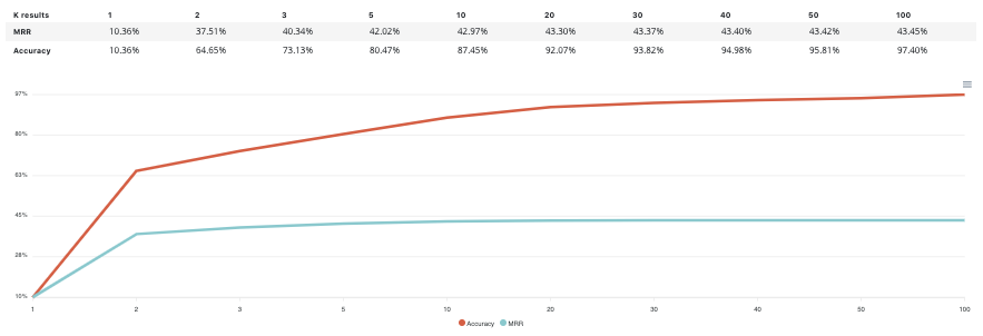
Accuracy VS K results |
No |
No |
No |
Yes |
No |
No |
No |
No |
No |
Please note that you can download every graph displayed in the interface by clicking on the top right button of each graph and selecting the format you want.
Scatter plot graph
This graph illustrates the actual values versus the values predicted by the model. A powerful model gathers the point cloud around the orange line.
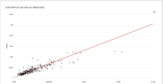
Scatter plot
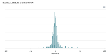
Residual errors distribution
This graph illustrates the dispersion of errors, i.e. residuals. A successful model displays centered and symmetric residues around 0.
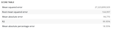
Score table (textual)
Among the displayed metrics, we have:
The mean square error (MSE)
The root of the mean square error (RMSE)
The mean absolute error (MAE)
The coefficient of determination (R2)
The mean absolute percentage error (MAPE)
Slider
For a binary classification, some graphs and scores may vary according to a probability threshold in relation to which the upper values are considered positive and the lower values negative. This is the case for:
The scores
The confusion matrix
The cost matrix
Thus, you can define the optimal threshold according to your preferences. By default, the threshold corresponds to the one that minimizes the F1-Score. Should you change the position of the threshold, you can click on the « back to optimal » link to position the cursor back to the probability that maximizes the F1-Score.

Cost matrix
Provided that you can quantify the gains or losses associated with true positives, false positives, false negatives, and true negatives, the cost matrix works as an estimator of the average gain for a prediction made by your classifier. In the case explained below, each prediction yields an average of €2.83.
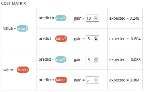
The matrix is initiated with default values that can be freely modified.
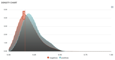
Density chart
The density graph allows you to understand the density of positives and negatives among the predictions. The more efficient your classifier is, the more the 2 density curves are disjointed and centered around 0 and 1.
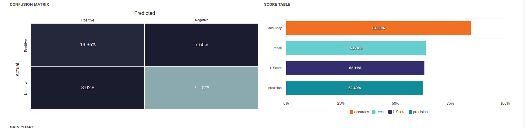
Confusion matrix
The confusion matrix helps to understand the distribution of true positives, false positives, true negatives and false negatives according to the probability threshold. The boxes in the matrix are darker for large quantities and lighter for small quantities.
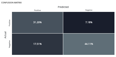
Ideally, most classified individuals should be located on the diagonal of your matrix.
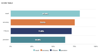
Score table (graphical)
Among the displayed metrics, we have:
Accuracy: The sum of true positives and true negatives divided by the number of individuals
F1-Score: Harmonic mean of the precision and the recall
Precision: True positives divided by the sum of positives
Recall: True positives divided by the sum of true positives and false negatives
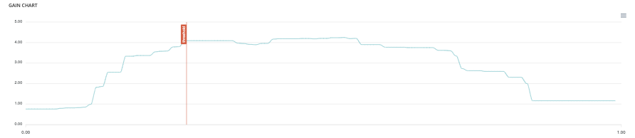
Gain chart
The gain graph allows you to quickly visualize the optimal threshold to select in order to maximise the gain as defined in the cost matrix.
Decision chart
The decision graph allows you to quickly visualize all the proposed metrics, regardless of the probability threshold. Thus, one can visualize at what point the maximum of each metric is reached, making it possible for one to choose its selection threshold.
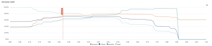
It should be noted that the discontinuous line curve illustrates the expected gain by prediction. It is therefore totally linked to the cost matrix and will be updated if you change the gain of one of the 4 possible cases in the matrix.
Lift per bin
The predictions are sorted in descending order and the lift of each decile (bin) is indicated in the graph. Example: A lift of 4 means that there are 4 times more positives in the considered decile than on average in the population.
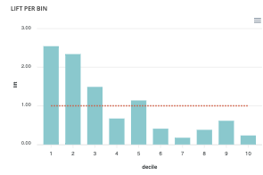
The orange horizontal line shows a lift at 1.
Cumulated lift
The objective of this curve is to measure what proportion of the positives can be achieved by targeting only a subsample of the population. It therefore illustrates the proportion of positives according to the proportion of the selected sub-population.
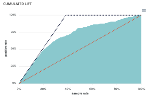
A diagonal line (orange) illustrates a random pattern (= x % of the positives are obtained by randomly drawing x % of the population). A segmented line (blue) illustrates a perfect model (= 100% of positives are obtained by targeting only the population’s positive rate).
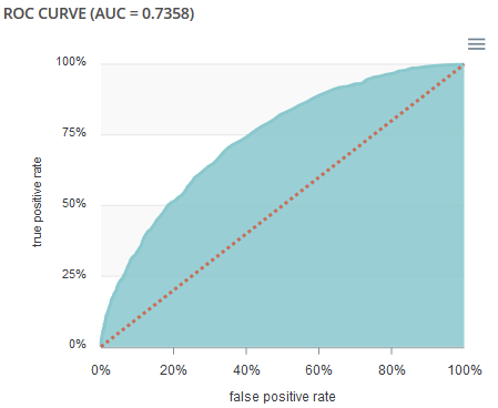
ROC curve
The ROC curve illustrates the overall performance of the classifier (more info: https://en.wikipedia.org/wiki/Receiver_operating_characteristic). The more the curve appears linear, the closer the quality of the classifier is to a random process. The more the curve tends towards the upper left side, the closer the quality of your classifier is to perfection.
Accuracy VS K results
this graph shows the evolution of accuracy and MRR for several value of K results